Prussian Blue - Confessions of a Nocturne Painter
Perspectives from The Artist's Road
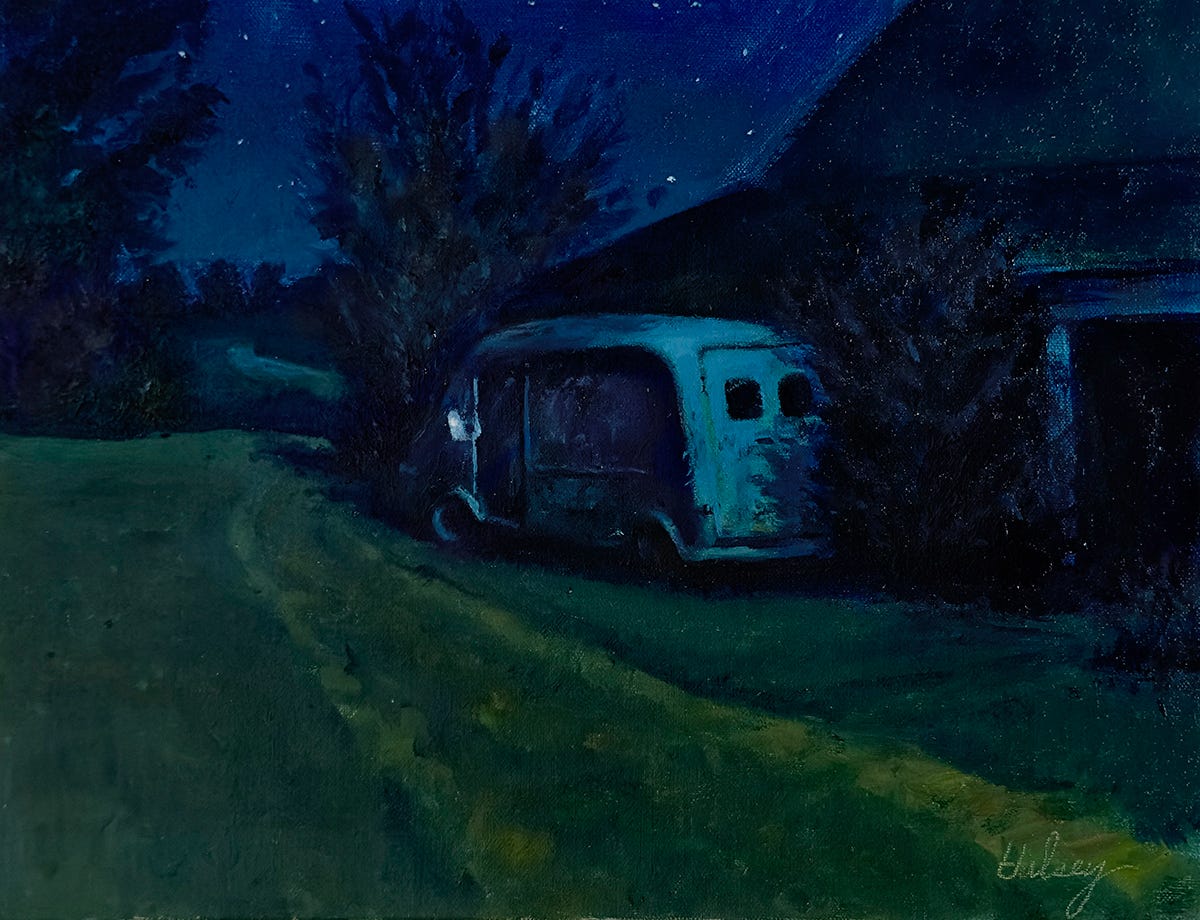
It started innocently enough, as I suppose these things do in the beginning. It quickly grew into something deeper and more complicated, my love for this color. It was a chance meeting, a casual thing I often do, hanging out in art supply stores, introducing myself to other oil paint colors and bringing them back to my place for the night, or maybe longer.
As I look back now, this meet-up was probably inevitable. It was a time when I was restlessly walking the streets at night, searching for the perfect Nocturne subject to spend my evenings with. But no matter what I tried, no mixes could answer my need for the perfect dark color which could express my deepest desires and visions of the night. Sure, I had sampled all the blacks around - Mars, Pyrelene, Ivory, Lamp, even Gamblin’s Chromatic, but none of them could satisfy me. I needed a deep color which could mate up and expand my palette in the darkest way. Then I met Prussian Blue.
I have to admit, at first I was blinded by its intensity, its chameleon-like changeability, its desire to totally possess every other member of my palette. I ignored how some colors were ruined by the merest touch of Prussian, such was my thrill at finally finding my El Dorado, the perfect dark. Introducing Prussian to Burnt Umber was a match made in heaven and created the richest of neutral browns. With the slightest additional touch of Prussian, that brown would change temperature and create the rarest of things, a dark color, both cool and warm, perfect for the tonal and temperature demands of Nocturne subjects. Magic!
What happened next cemented the relationship and added Prussian permanently to my household. On a hunch, I decided to tone my entire Nocturne canvases with Prussian and a little Galkyd medium before I drew on my composition. This was risky. Prussian gets into everything, like ink in water. Any colors laid into a wet layer of it are changed forever. I had to learn how to paint in a new way to get these color marriages to work. This was exciting. With that tonal layer, the sky was all in, and a little wiping back created that city-lights glow on the horizon. Now that the entire picture was wedded to the same cool dark, anything added over the top would be harmonious and night-like. The deep shadows were also finished. All that was left were the mid-tones and a highlight, only three more steps of value. And when it comes to dark, blackish cool greens, Prussian mixed with a touch of Yellow Ochre or Cadmium Yellow Medium says it all. Prussian Blue is the queen of Nocturne colors.
Regrettably, there is a darker side to Prussian Blue. A side of it I have come to be wary of. It requires very careful handling. It is flighty and gets onto everything - carpets, clothing, furniture, shoes, my friends and even visitors. It is hard to clean out of brushes or anything else. It is a stainer. The rugs in our studios are forever marked with spots of it tracked by shoes or on the paws of our dogs. It has even migrated downstairs onto the carpet and furniture there. Is this relationship worth it? I don’t know, but I’m in too deep to change now. If you meet Prussian somewhere, sometime, remember me and be careful. That’s my story.
For more about the discovery of Prussian and other blue pigments, paid subscribers can read:


Brilliant writing - this is how to teach colour!