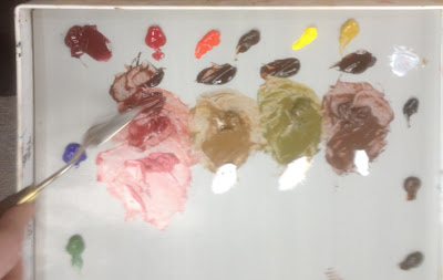
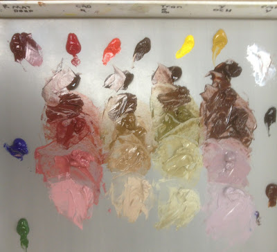
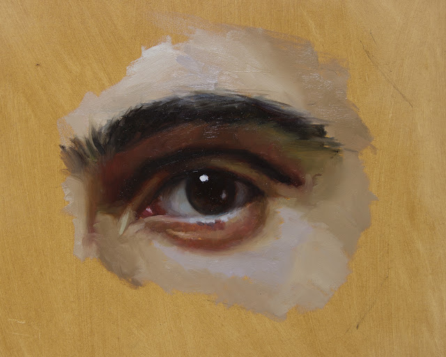
Using Color Strings to Create Flesh Tones in Portrait Paintings by Terry StricklandThe science of color mixing can be very important for the student to grasp early. We were taught color theory in art school, but the actual skill of mixing colors and values was left to chance and experimentation. Working that way can be frustrating and time consuming, but need not be so. Over the years we've researched traditional methods of color mixing as taught by the old masters and the Academies in Paris and the great portrait painters such as Zorn, Sargent and Sorolla looking for a reliable, logical system which would serve our art. This research led us to “color strings”, which are simply premixed layouts of the major color masses in our subject, from warm to cool, and dark to light.
This has several compelling benefits which we find useful. First, by identifying and mixing the major mass-tones at the very first, we avoid the mistake of continuously remixing slightly different colors throughout the course of the work. This ensures that the color scheme of the work remains harmonious and clean. Also, by premixing, we are able to speed up the painting process and work uninterrupted by the need to mix new paint. In addition, by having our cools, warms, highlights and accents already on the palette, value and temperature comparisons can be made and selected quickly and accurately, thus saving much overpainting and scraping out on the canvas itself. We found this demonstration of the use of a color string in portrait painting on Terry Strickland’s website and asked her permission to republish it here. For more on this topic, see Color Mixing Secrets for the Plain Air Painter. Using Color Strings to Create Flesh Tones in Portrait Painting
by Terry Strickland
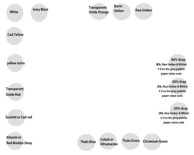
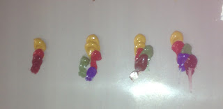
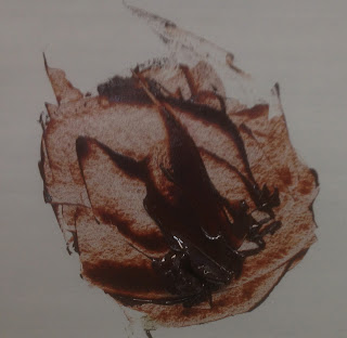
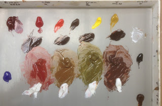
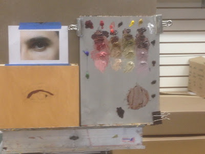
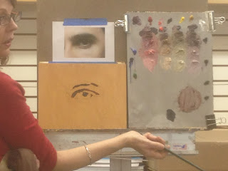
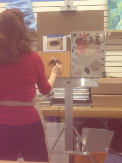
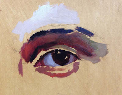
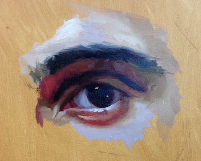
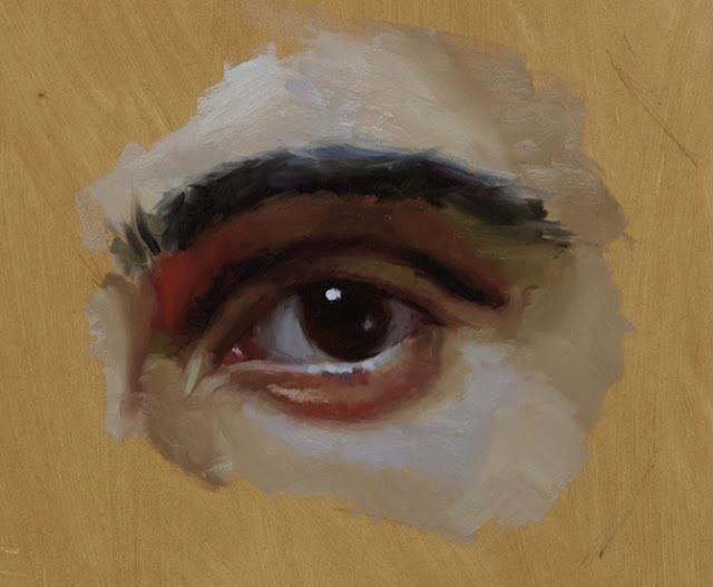
 This is what I have developed over the years. It works for me. I am constantly trying new things but for now this is my go-to starting place. I develop 4 basic flesh tones. Having a method helps me and seems to help my students.
Article and images copyright Terry Strickland and reprinted here with permission. To see more of Strickland's work, visit her website: Terry Strickland Art Terry Strickland graduated with a degree in Graphic Design from the University of Central Florida. She pursued a career in graphics for several years before devoting herself full-time to her fine art work in 2005. Since then she has become well known for her portraits and still life work.
She writes: "I'm intrigued by the idea of a work of art looking like an old master's painting but with a contemporary edge, as an artist I want to be a filter for the time I live in. I'm frequently inspired by fairy tales, superheroes, or works of literature, and reexamine them in a contemporary way. Mythical characters may become a device to explore our responses to modern day situations, for example Superman becomes a symbol for the mighty dreams each of us hold close to our chests." |
Become an Artist's Road Member Today!
Already a Member?Log in here. To renew your membership, log in and follow the links. Search the SitePerspectivesNot ready to become a Member yet? Subscribe to our free email postcards, "Perspectives". Enter your email address here.
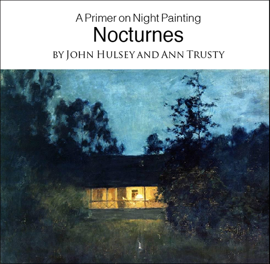
Member ContentFree ContentThe Artist's Road StoreNocturnes - A Primer on Night Painting Filled with inspirational examples by the masters of nightime painting, this little book is sure to fire up your creative energies. Never tried painting at night? We show you how it's done with a step-by-step-oil demo and a tale of night painting in the wilds of Rocky Mountain National Park. The Primer on Night Painting - Nocturnes is a 7 x 7" PDF download with 40 pages of text and images. It includes a gallery of paintings by masters of the nocturne, information to inspire and encourage you in your plein air nocturne painting, an illustrated step-by-step demo and tips for working in pastel and oil. Also available in a softcover edition. Check out the tools and other products that we use in our own art and travels in The Artist's Road Store. We only offer things for sale that we enthusiastically believe in.
About Us
|

 Voices of Experience:Richard K. Blades
 ing Watercolors
 Nocturne Notes
 Inspiration in Monet's Gardens
 The Watercolor Medium

 The Perspectives Archive