Floating in the Blue

Floating in the Blue

"How sweet to be a cloud floating in the blue."

                                                      A. A. Milne

Autumn Cottonwoods, 12 x 16", Oil, © Howard Friedland
Autumn Cottonwoods          12 x 16"          Oil            Howard Friedland

   But which blue? Painting a beautiful blue sky can be a challenge. Changing atmospheric conditions, time of day, time of year—all can create nuanced, or sometimes dramatic, variations in the color of blue of the sky. For the landscape painter, learning the characteristics of available blue pigments is essential. We asked two master landscape artists, Howard Friedland and George Van Hook about what they reach for when they begin to block in a sky and to show us some examples in their oil paintings.

Howard Friedland - https://www.howardfriedland.com

Teton Grandeur, 24 x 36", Oil, © Howard Friedland
Teton Grandeur               24 x 36"               Oil              Howard Friedland

   "Skies can be any color and not just blue. That said, I have Cobalt Blue, Ultramarine and Cerulean Blue as staples on my palette. I think of Cobalt as the purest and coolest of the blues since Ultramarine has a blue-violet cast and Cerulean has a comparatively warmer (greener) feeling. The key is to remember that color is relative and will look a certain way when placed next to other colors. Even Viridian Green can look bluish in certain color combinations.

   When I think about painting skies, I remember that whichever blue I use, on a clear sunny day it will influence the horizontal planes and the ground and much of the shadow color. Therefore, whichever blue I use, I'll want it to harmonize with the rest of the painting.

   The other thing I look for is gradation in the sky. How does the color transition from warmer to cooler? Notice how the sky above you, at the zenith, is a darker and purer blue. As the sky descends slowly toward the horizon, it gets lighter and gradually warmer. Also, depending on the time of day, it might graduate warmer to cooler from side to side. The key is to observe the differences. Here is a neat way to observe the color shift:  using your finger, point at the sky moving it slowly from side to side or zenith to horizon. Now watch the sky change temperature as you move your finger.

   On a clear sunny day, the sky could be a light Cobalt Blue at the top of your painting and as it descends down to the horizon you might see it warm up to a light Viridian Green hue and at the point where you lost sight of the sky, it might even have a red-violet tone like a bit of Alizarin Crimson blush."

Lyrical Light, 24 x 30", Oil, © Howard Friedland
Lyrical Light              24 x 30"              Oil              Howard Friedland

   "There is no real formula to choosing which blue to use in your sky. Some paintings call for a warmer Cerulean sky; some for a cooler Cobalt one or some Ultramarine or combinations of all there or even other blues. It all depends on what other colors are in your painting.

   I've had many paintings that I have repainted the sky several times changing the blue. You will know when the right one clicks. Just trust your instincts and keep trying until it WORKS!"

   We encourage everyone to make color charts to refer to when painting. Colors can vary substantially according to brand, as shown in the Cerulean Blues (Richeson and Gamblin) shown below. In addition to the most used blues, it can be fun to try a few special colors. (Colors will vary by monitor screen as well. Be sure to try your own color charts.)

Color Pigment Chart - Ann Trusty

George Van Hook - https://www.georgevanhookfineartist.com

A Summer Cast, 24 x 30", Oil, © George Van Hook
A Summer Cast          24 x 30"          Oil          George Van Hook

Autumn Valley, 24 x 30", Oil, © George Van Hook
Autumn Valley              24 x 30"          Oil          George Van Hook

   Above: Low pressure moving in from the south (left side); high pressure still to the north.

   "I use Ultramarine and Cobalt as my primary blues. They are slightly different in color temperatures, which can be best understood by mixing them out with a white. If you do this side by side, you can compare the two chromas. And, of course, the Ultramarine is essentially transparent, while the Cobalt is opaque.

   The important question when painting skies is what colors will you be mixing with the blues and how will you go about doing that? That is where the "Art" comes in. I never use just a pure blue (plus white) for a sky, because the colors and temperature are so dependent on time of day and surrounding colors. I almost always mix either a red or a yellow into my "blue" sky and this becomes compounded by the presence of a cloud cover. Here in the Northeast, we frequently have a variety of moisture-laden frontal systems moving through at the same time, so, to accurately describe a local sky, you may have to create several "color schemes" on the same canvas. For myself, this is the real joy in painting our skies, but it may appear daunting for the beginning artist."

November Light, 24 x 30", Oil, © George Van Hook
November Light               24 x 30"               Oil               George Van Hook

Farm Lane in Winter, 24 x 30", Oil, © George Van Hook
Farm Lane in Winter               24 x 30"              Oil               George Van Hook

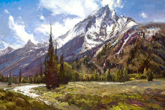
   Above:  Moisture laden skies helping to create atmosphere and softening the forms throughout.

   Many thanks to two of our favorite artists!


Copyright Hulsey Trusty Designs, L.L.C. (except where noted). All rights reserved.
Become an Artist's Road Member Today!

The Artist's Road LogoClick here to become a Member and enjoy access to all the in-depth painting and travel articles, videos and tutorials. Guaranteed!

Search the Site
Perspectives

Not ready to become a Member yet? Subscribe to our free email postcards, "Perspectives". Enter your email address here.

The Artist's Road Store
A Primer on Night Painting - Nocturnes

Nocturnes - A Primer on Night Painting

Filled with inspirational examples by the masters of nightime painting, this little book is sure to fire up your creative energies. Never tried painting at night? We show you how it's done with a step-by-step-oil demo and a tale of night painting in the wilds of Rocky Mountain National Park. The Primer on Night Painting - Nocturnes is a 7 x 7" PDF download with 40 pages of text and images. It includes a gallery of paintings by masters of the nocturne, information to inspire and encourage you in your plein air nocturne painting, an illustrated step-by-step demo and tips for working in pastel and oil. Also available in a softcover edition. Check out the tools and other products that we use in our own art and travels in The Artist's Road Store. We only offer things for sale that we enthusiastically believe in.

Save

Save

Save

Save

Save

Save

About Us

Photograph of John Hulsey and Ann Trusty in Glacier National Park
We are artists, authors and teachers with over 40 years of experience in painting the world's beautiful places. We created The Artist's Road in order to share our knowledge and experiences with you, and create a community of like-minded individuals.  You can learn more about us and see our original paintings by clicking on the links below.
About Ann
     About John
 Hulsey Trusty Studios